
Southeast Queens Film Fesitval
Project Type
Role
Internship
Graphic Designer
Tools Used
Year
Illustrator, Procreate
2026
The Southeast Queens Film Festival was born from a collaboration between the Southeast Queens Center for History and Culture (SEQCHC), a grassroots nonprofit organization dedicated to uplifting and celebrating the rich history of Southeast Jamaica, Queens, and the York College Art History Program. The project was part of the Jamaica Forum for Public Art Otherwise, an initiative led by Emily Verla Bovino, PhD, and supported by the Social Practice CUNY (SPCUNY) Faculty Fellowship 2024–2025.
The inaugural festival aimed to uplift local filmmakers with connections to Southeast Queens and the Jamaica community. As this was the first year of the festival, I was given the opportunity to take on a major role in developing its visual identity and promotional materials. As a senior in the final year of my degree, I was also completing my internship requirements, making this project an especially valuable opportunity to gain hands-on professional experience. I was responsible for designing the festival's digital campaign along with its digital and print assets.
Throughout the internship, I learned a great deal about the realities of working as a freelance designer, from conducting research and developing a visual identity to designing individual assets and managing the overall production process. Much of the design work and project management was handled independently by me while balancing being a full-time student, a part-time job, and a second internship.
The project required a significant amount of time and energy, particularly because we had roughly two months to bring the festival and its visual materials together. Looking back, I am not completely satisfied with every design decision or final asset, but I am proud of what I was able to accomplish under the circumstances. More importantly, the experience taught me how to manage a large-scale design project, work within tight deadlines, respond to feedback, organize production files, and adapt when plans changed. Completing such a demanding project while balancing my other responsibilities was an accomplishment in itself, and the experience has given me a much clearer understanding of the kind of designer I want to become.
The Process
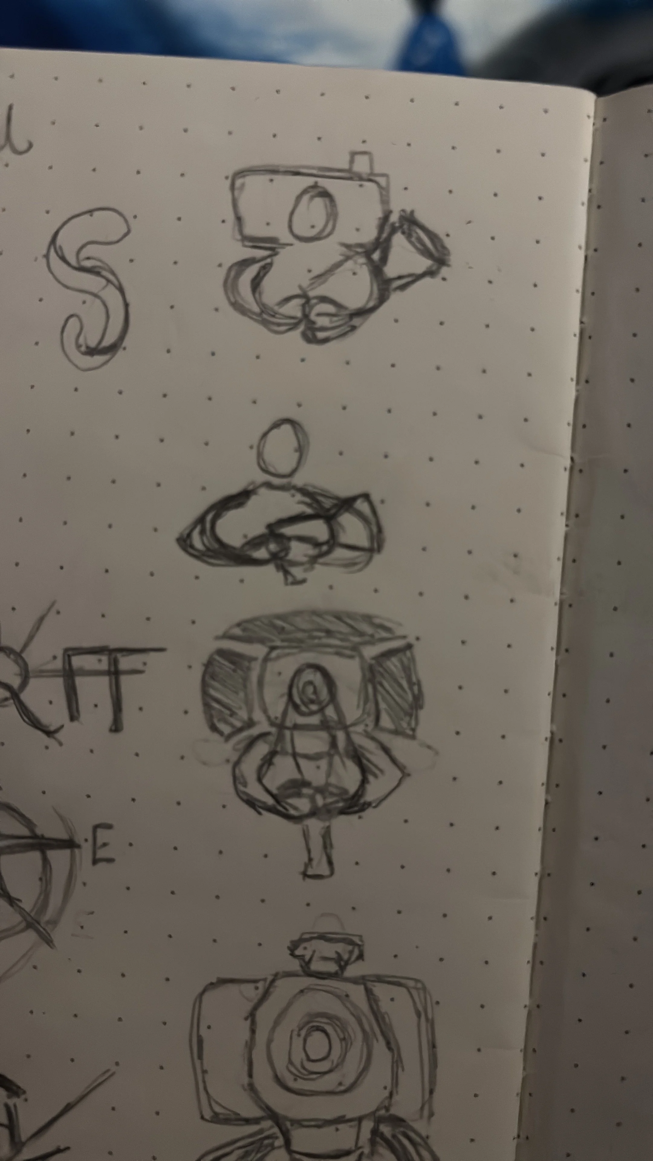
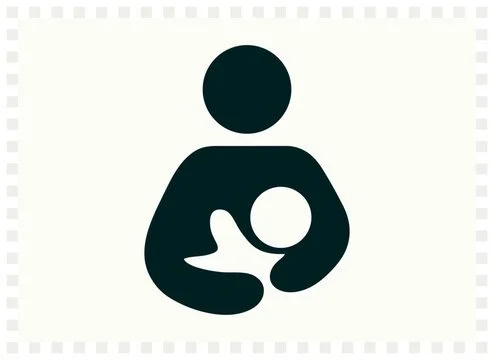
When developing the logo for the film festival I started with an initial sketch of a camera, however, I wanted something that communicated the infancy/newness of the festival, as well as it’s emphasis on supporting new local filmmakers. The idea of a mother cradling a baby quickly came to mind. Add a camera, and boom, the idea was born.
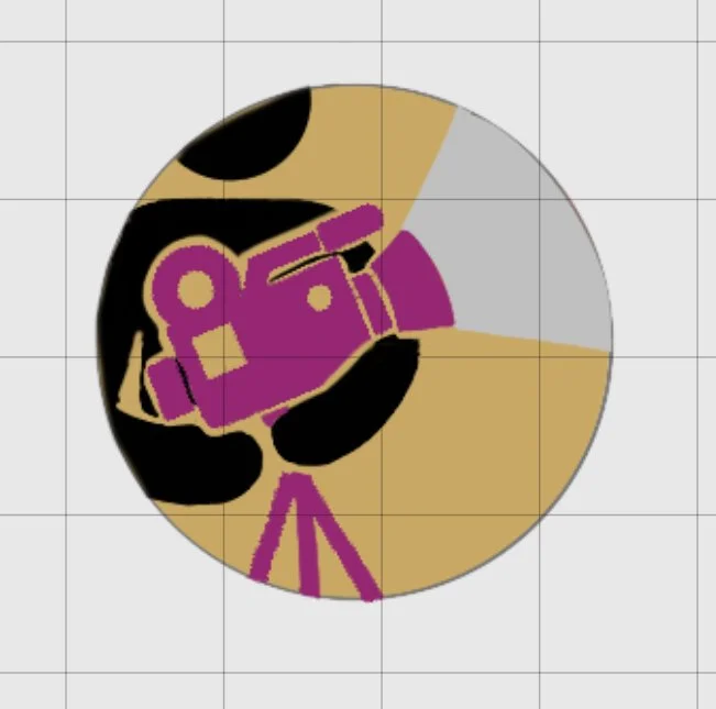

Once the initial idea was made I toyed around with it in Procreate before vectorizing it in Illustrator. The character cradling the camera symbolized the way this festival would cradle young filmmakers (mostly students) to share their local/indie films or projects.
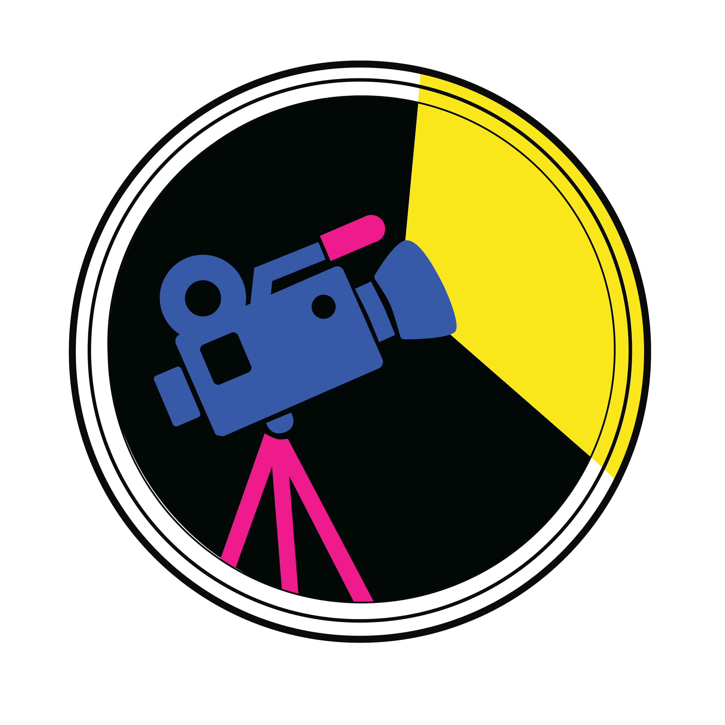
After submitting the first version of the logo for feedback, it was determined that, due to creative differences, the figure was not successfully communicating the idea of cradling the camera and was ultimately removed.
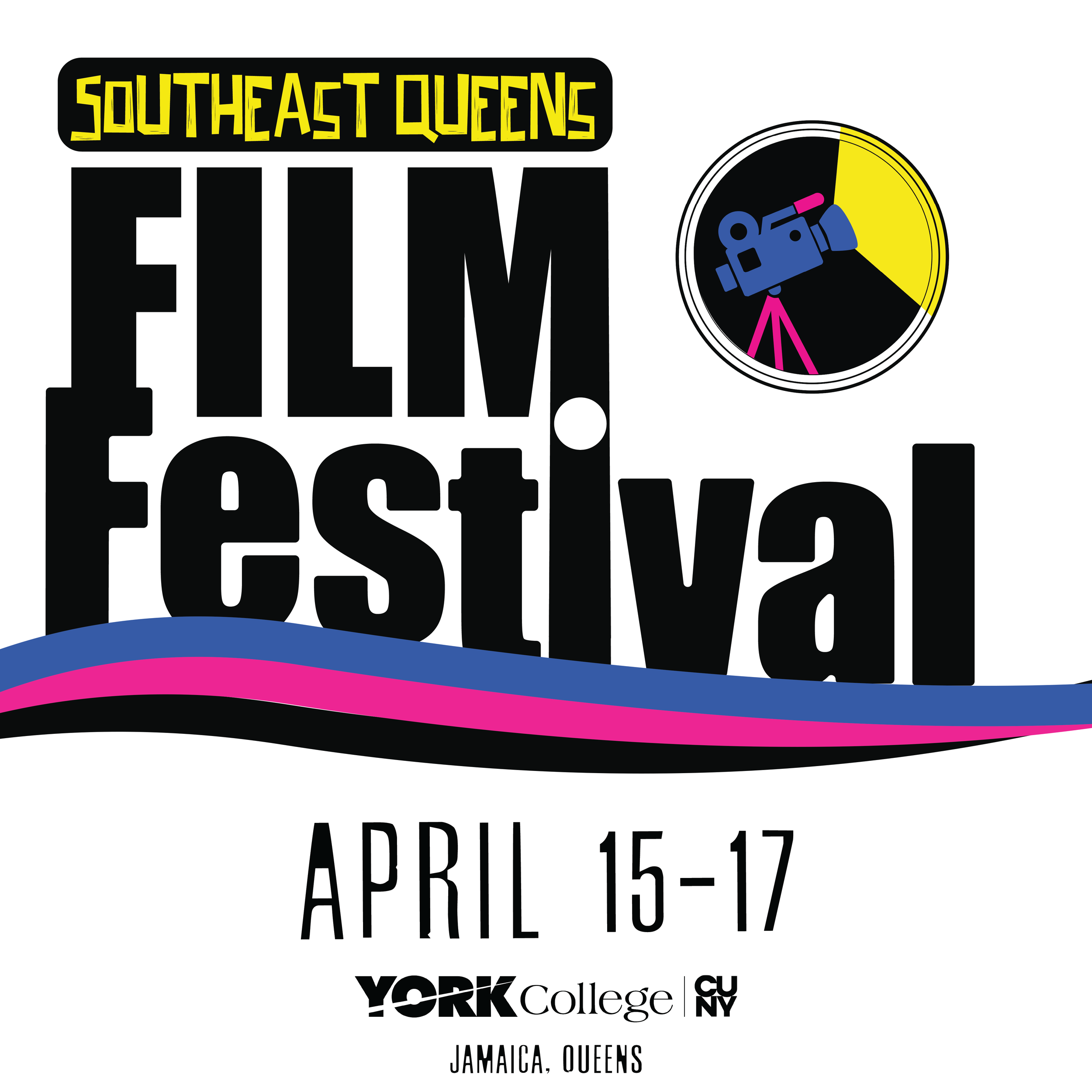
Personally, I found the resulting logo somewhat generic for a film festival. However, the use of vibrant colors and the beam of light emerging from the camera helped give the identity more visual interest. The beam also creates a strong directional element that naturally guides the viewer’s eye.
