King Manor Museum Website Redesign
Project Type
Role
Freelance/Client Work
Web Designer
Tools Used
Year
Figma, Squarespace
2026
As a recent graduate entering an intimidating new chapter, I was incredibly excited when the King Manor staff approached me with the opportunity to redesign their entire website. Having previously interned at the museum, I was already familiar with the staff, the organization, and the ins and outs of working with Squarespace. This project was also the perfect opportunity to put my web design and coding skills into practice on a real-world project.
Before bringing me onto the project, the museum had hired Harness Technologies Inc. to renovate the website. However, after an unsatisfactory experience with the project, Museum Director Kelsey Brow decided that I would be a better fit for the redesign based on the work I had completed during my internship. I was genuinely honored to be trusted with such a large project and took the responsibility seriously.
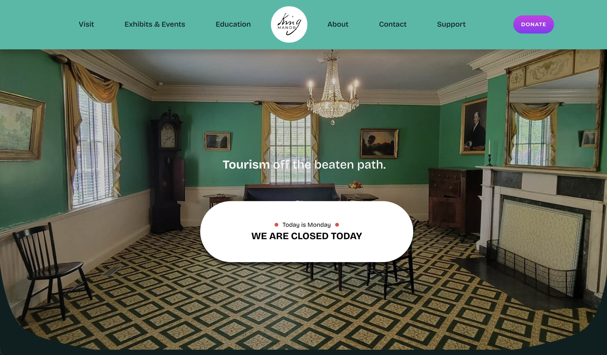
Throughout the redesign, I scheduled regular meetings with the director and other museum staff to understand their goals, concerns, and vision for the new site. My goal was not to completely reinvent the museum’s online presence, but to build upon what was already there, improving the site's functionality, navigation, and visual presentation while maintaining the established branding and identity of King Manor.
In addition to redesigning the site, I developed a comprehensive style guide to establish consistent typography, colors, spacing, and other visual standards across the website. I also created tutorials and documentation explaining how to update the site's custom code and styles, allowing the museum staff to make future changes and maintain the site's visual consistency without having to rely on me for every update.
The final result was met with an overwhelmingly positive response from the museum staff. The redesigned website went live just in time for the museum’s annual Constitution & Cocktails fundraiser, where the new site was officially revealed.
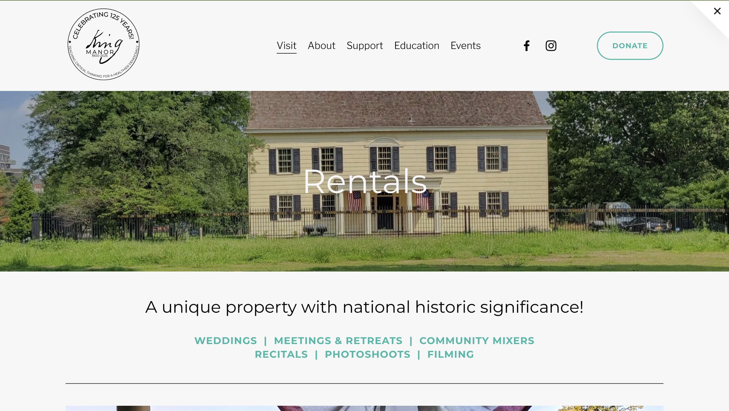
Old Design
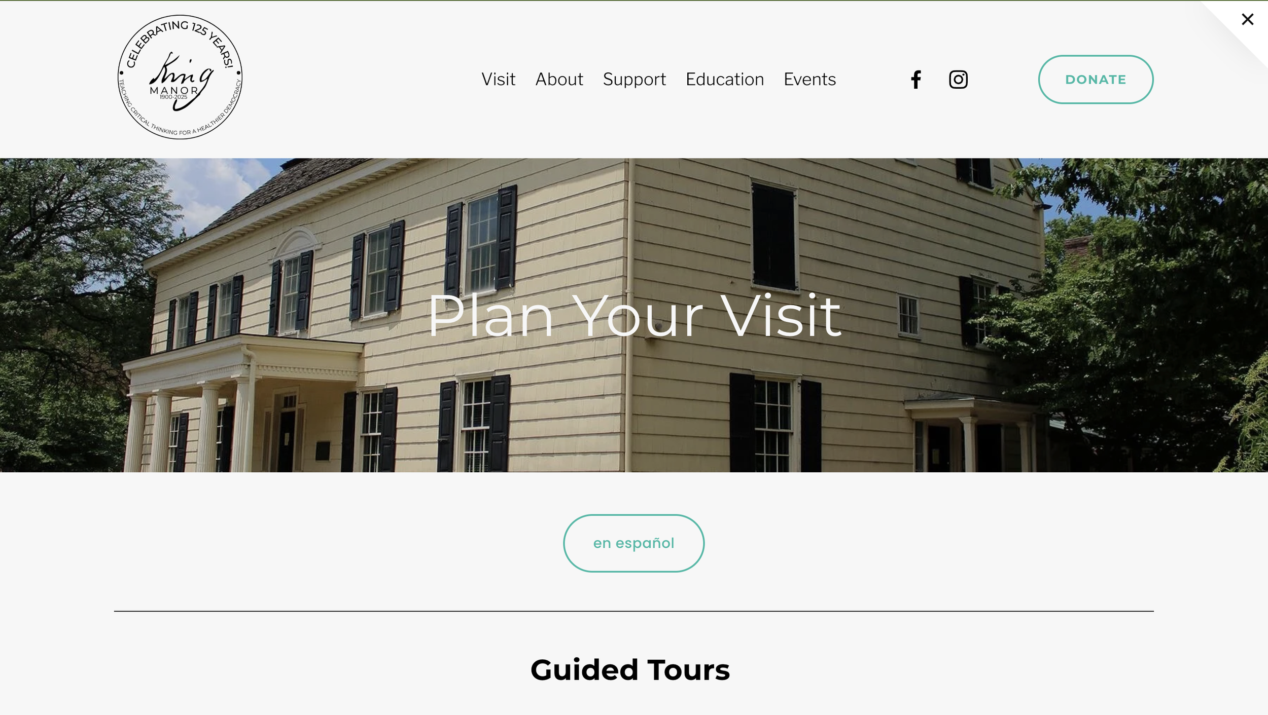
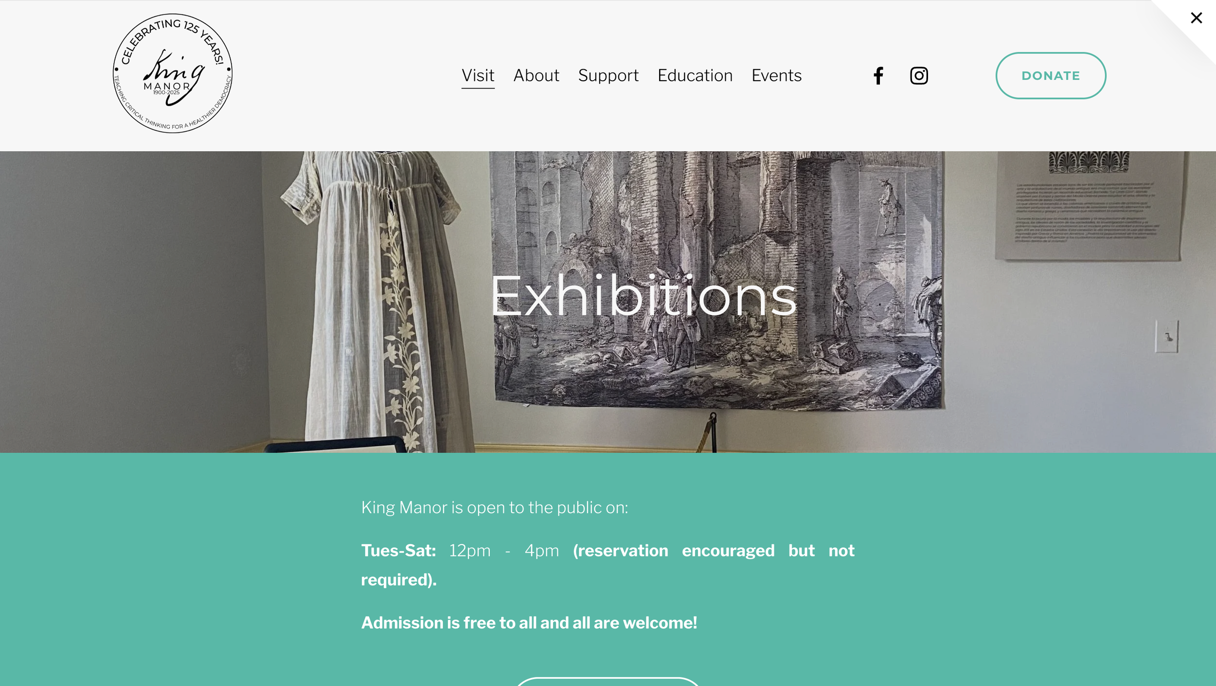
The website’s old design felt, just that, old and outdated. There wasn’t that much visual interest throughout the pages; nothing stood out or made you want to keep scrolling. Many of the pages lacked personality and adequate use of space/negative space.
Exhibit pages were inconsistent site-wide. Some followed different style guides, using different fonts and layouts making them feel disjointed from the rest of the site, However, most of it did stay the same after reevalutating what was important and what was not. Information hierarchy!
The Process
Notice the semicircular section:
A callback to the curved wall of the King Manor dining room, which at the time was unique not only to the surrounding area but also to the time period. I wanted this unique characteristic to drive most of the design elements for the redesign.
The museum staff wanted to emphasize the increasing museum visitations and bookings, which pushed the front page to house more options for planning our visit to the museum, or having the staff visit your school through their curriculum.
The process of coming up with a redesign was no simple task. It came with days of researching, and cross referencing other historical house museum websites to come up with something that didn’t feel too hardened or sterile as other national museum websites. After drawing out multiple layouts of wireframes, I moved into Figma creating a very simple prototype.
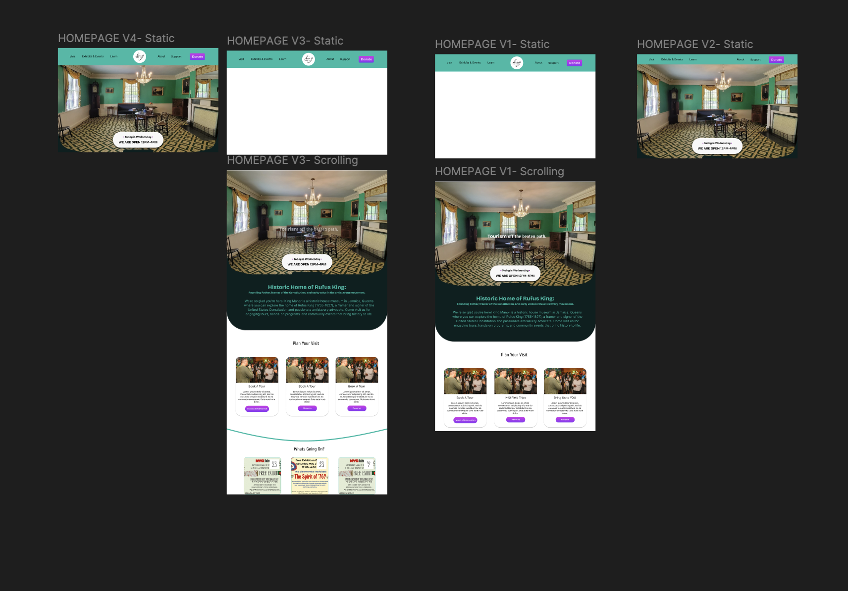
Once the “ugly” wireframe prototype was done, it was time for some color! The museum’s color palette and visual identity were already pretty solid; it just needed something to pop slightly, and that’s where the purple came in. With the teal and dark gray doing the heavy lifting, the purple stood firm as an accent color to draw the eye.